Light
Dark

Case Study
Nova Financial
A website and motion system for a health brand that wanted calm visitors could feel before they read a word.
Services :
Web, Motion
Year :
2024
Timeline :
7 weeks
The Challenge
Kaya's offers were strong — programs, rituals, a clear philosophy — but the site felt like a medical PDF. Cold typography, stiff motion, zero atmosphere. Visitors bounced before they reached the offerings. The brief was simple: make the site feel like the practice.
The Solution
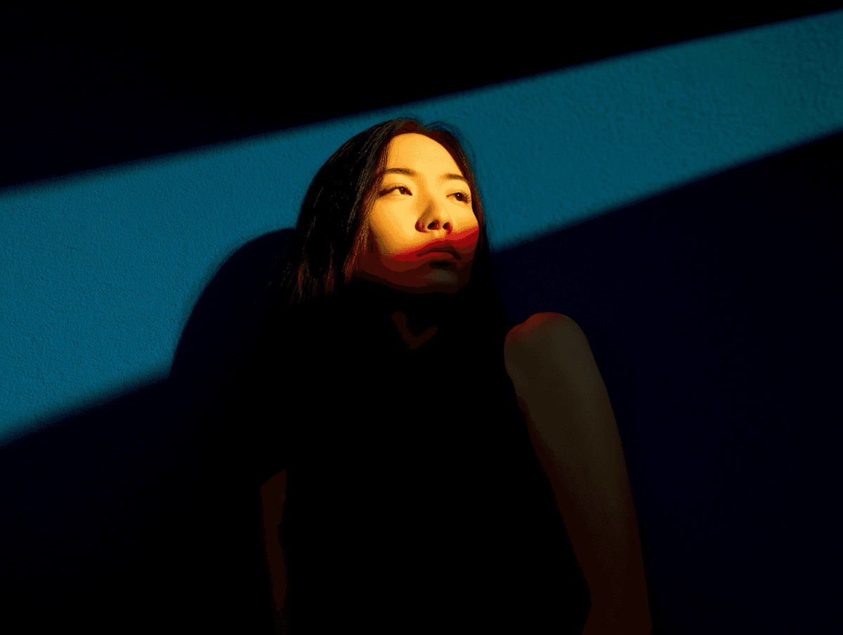
The site was redesigned as a slow, intentional scroll — soft transitions, restrained type, photography that feels human. Motion cues guide attention without shouting. Booking and program discovery sit one clear step away from every chapter of the story.
Motion that calms, not sells.
A lightweight motion language — fades, drifts, soft parallax — was documented so Kaya's team can extend it across campaigns without hiring animators each time.
Behind the Work
Handoff
Keep looking





Journal